
Environmental Graphic Design at Scale: The New York Office Mural
- Apr 24
- 6 min read

Project Overview
Project: MBH Architects New York Office Wall Mural
Location: 250 Hudson St. New York, NY
Client: MBH Architects
MBH Role: Environmental Graphic Design (EGD)
Project Type: Environmental Graphic / Interior Mural Installation
Design Team: MBH Environmental Graphic Design Studio
Status: Completed
At MBH, Environmental Graphic Design is not applied at the end of a project. It is developed as an integrated layer of architecture, interiors, and brand expression from the very beginning.
The New York office mural exemplifies this approach. Treated with the same rigor, process, and budget discipline MBH brings to every external client engagement, it was never simply an internal project. What began as a graphic exploration evolved into a spatial experience that reflects both place and practice, transforming a transitional wall into a defining moment within the office.


From Inspiration to System: Building the Concept
The design process began with a wide range of visual and cultural references. The team explored typography, urban textures, street-level imagery, and graphic abstraction to understand how New York could be represented beyond the expected skyline.
From the outset, the team was aware of a risk that shapes every place-based EGD project: the danger of imposing an outsider's perception of a city onto the people who actually live and work in it. New York is iconic precisely because it means something different to everyone who experiences it. Rather than default to widely recognized landmarks, the team brought in MBH's own New York staff, whose perspectives proved as diverse as the city itself, spanning graffiti and minimalism, quiet luxury and dollar slices, sports teams and neighborhood history. The challenge was to find a way to make all of those points of view feel seen and understood within a single composition.
The solution was rooted in collage. Collage art has historically allowed different styles, perspectives, and visual registers to coexist within a single frame with equity and clarity. Applied here, it became the conceptual framework for the entire mural, allowing the piece to feel less like a designed representation of New York and more like the experience of moving through it: a commute, with the city's diverse architecture passing by side by side.
These inputs were distilled into a set of core themes that balanced energy, density, and clarity.
Rather than replicate the city literally, the team developed a graphic language that captures how New York feels: dynamic, layered, and constantly in motion.
Design Challenges: Speed, Scale, and Restraint
Like any client engagement, this project came with real constraints. The team was working to a tight deadline driven by an upcoming office event, which compressed the concept and production timeline considerably.
A more technical challenge involved sourcing photography that would hold resolution at close viewing distances. Most large-scale graphics are designed to be read from across a room, where some loss of image quality is acceptable. In this space, the proximity of the viewer to the wall demanded material that could withstand scrutiny up close, which shaped both the image sourcing process and decisions about which elements of the composition to render photographically versus graphically.
Threading through both challenges was a subtler design problem: how to create something bold and visually rich without overwhelming a space that people inhabit and work in every day. The answer lay in careful calibration of scale, composition, and color, and in knowing when to exercise creative restraint.


Design Integration: Where Graphics Meet Space
A defining strength of this project is how closely the mural was coordinated with the interior architecture.
During the coordination phase, the EGD team worked directly within the spatial model to align the mural with sightlines and circulation paths, entry sequences and moments of arrival, and wall proportions and adjacent architectural elements. The team also designed with visibility from outside the suite in mind: the mural is intentionally legible through the glass entry doors, functioning as a wayfinding device that draws visitors toward the office before they have crossed the threshold.
Color decisions extended beyond the mural itself. The mural's palette is built around sunset tones — orange, peach, and teal — that echo the quality of light reflected in New York's high-rise glazing on a clear day. These colors bring vibrancy and warmth to the composition. However, the team recognized that those same tones, applied directly to the surrounding walls, would risk overwhelming the space. Working proactively beyond the scope of the graphic itself, the EGD team recommended a complementary wall paint palette: more neutral in tone but still cohesive with the mural colors and the broader New York theme. The result is an environment where the graphic reads as the focal point it was designed to be, supported rather than competed with by everything around it.
This level of integration ensures that the mural does not function as decoration. It becomes part of how the space is experienced and understood.

The Final Expression: A Contemporary New York Narrative
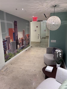
The final mural translates the concept into a layered city composition that blends abstraction with recognizable form. Architectural silhouettes are simplified into bold geometric shapes; color gradients introduce depth and atmosphere; the composition scales continuously across the wall to create a unified visual field.
The linework deserves particular attention. Abstract in appearance, it was in fact carefully calibrated to reference the graphic language of the New York City subway map, an icon immediately legible to locals and visitors alike. Rather than functioning purely as a compositional device, it reinforces the local iconography of the piece and introduces a playful geometry that rewards closer looking.
The skyline itself reflects deliberate creative decisions about realism versus legibility. The team played with the relative scale of buildings to create a sense of depth, and took compositional license with which structures appear side by side. The goal was not architectural accuracy, but the feeling of a collage: a New York that is recognizable without being literal, and personal without being exclusive.
The result is a piece that reads at multiple levels. From a distance, it establishes identity and presence. Up close, it reveals detail and texture — the linework, the layering, the palette choices that connect the graphic to its specific place in the world.
Impact: More Than a Wall Graphic
The mural transforms a transitional corridor into a branded experience. It anchors the office in its New York context while reinforcing MBH's design ethos.
While staff encounter it daily as a constant backdrop to their work, the mural is designed with visiting clients and partners equally in mind. For someone walking into the office for the first time, it delivers an immediate and tangible impression of how MBH thinks, what the firm values, and what it is capable of producing. No explanation required.
It also demonstrates something that clients often underestimate about Environmental Graphic Design: wayfinding is not just about signage and instruction. This mural functions as a wayfinding device in its own right, guiding visitors to the office through the building without a direct logo. Even the placement of the suite's door hardware was considered within the composition, with the entry button positioned to read as part of the graphic rather than interrupt it. Design at this level of resolution is what separates EGD that performs from EGD that merely decorates.
What This Project Demonstrates About Environmental Graphic Design
This project reflects several core capabilities of MBH's EGD practice:
Integrated Thinking — Graphics are developed in parallel with architecture and interiors, ensuring alignment from concept through execution. On this project, that integration extended to wall finishes, hardware placement, and exterior visibility.
Narrative Design — Each project begins with a story rooted in place, brand, and user experience. Here, that meant resisting the obvious and building a visual language that could hold the full diversity of New York perspectives within a single frame.
Scalable Systems — Design languages are built to adapt across surfaces, scales, and environments.
Execution Precision — From digital concept to built installation, the work maintains clarity and intent, even under compressed timelines and demanding technical constraints.
Looking Ahead
As workplaces continue to evolve, Environmental Graphic Design plays an increasingly critical role in shaping how spaces communicate, engage, and perform. The New York office mural is one example of how thoughtful, integrated design can transform everyday environments into meaningful experiences — ones that speak to the people who inhabit them every day, and leave a lasting impression on everyone who visits.
Interested in bringing this level of design integration to your next project?
Let's start the conversation.


